Chicago Tribune: 73 Lobby Article

By: Mary Ellen Podmolik
A custom-designed, tufted bourne sofa covered in lilac mohair. A $100,000-plus video monitor installation. Stone, Carrara marble, leather and suede wall coverings and the occasional eye-catching, conversation-starting art piece.
Before prospective renters walk past the concierges and the mailbox rooms to see the opulent amenities, the sweeping views and the small apartment square footage, downtown developers are trying to reel them in with swank lobbies designed to dazzle. With companies having so much riding on those first impressions — namely leases that add up to more than $24,000 a year — they’re hiring interior designers and art consultants to create memorable lobbies that seek to gingerly walk the line between home and hotel.
“Lobbies are hard,” said Ann Thompson, senior vice president of architecture and design at Related Midwest. “They’re your front door, but all of the functional things happen here. That first impression, either people identify with it or they don’t. It’s like a single-family home.”
Companies start creating the feeling, the theme, of their lobbies far ahead of time, and strive to make them homey yet durable and something a renter would want to come home to day after day. They also have to keep up with competing buildings, and that’s a challenge given the large number of high-end apartment buildings either in or recently out of the construction pipeline.
“It’s a little bit of one-upsmanship,” said Ron DeVries, a vice president at Appraisal Research Counselors. “We’ve seen that on the amenity floors. It’s the next logical stop to spend some dollars. The lobby is becoming an amenity space.”
Among the current must-haves for new high-rise residential buildings in Chicago are a lot of glass, high ceilings and appropriate lighting, so pedestrians and motorists can see into a building and like what they see.
The next challenges are to fit in with the location, appeal to the target demographic and be a little edgy, but not too edgy. The wow factor is critical, both to attract tenants as well as to impress their guests.
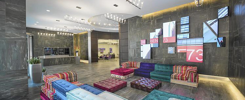
At 73 East Lake, M&R Development didn’t want the lobby to be so big that it resembled a hotel and didn’t want it to look institutional or officelike. The result is curving walls and a seating area outfitted with a low-profile Roche Bobois Mah Jong modular sectional covered in Missoni fabric. Hanging on the wall, visible from the sidewalk, are more than a dozen artfully arranged video monitors of various shapes and sizes that show a four-minute video loop of iconic images of Chicago.
“Ten years ago, if you had an audiovisual budget for speakers here, a TV there, you were talking $15,000 to $20,000,” said M&R President Anthony Rossi Sr. “It was nothing, a line item in your budget. Now you’re over $300,000 just on audiovisual.”
A video-monitor installation also is a focal point at Related Midwest’s recently opened OneEleven high-rise, but it evokes a much different feel with a seemingly static image spread over nine monitors. The goal for the space was a feeling of urban sophistication, with high contrast between the walls and floor and a lilac mohair sofa that lets people sit and watch the monitor or Wacker Drive.
“People are proud of where they live, and they want their friends to come in and be impressed,” Thompson said. “This lobby is meant to impress.”
The lobby of another rental building in Related’s portfolio, 500 Lake Shore Drive, is decidedly different because it aimed to evoke a certain light-filled casualness in keeping with its location near the lake.
In addition to location, Randy Fifield, vice chairman and principal at Fifield Cos., believes a building’s shape helps dictate how the company tackles a lobby.
At K2, whose location Fifield likens to an olive branch between River North and the West Loop, the company adopted a playful tone with Carrara marble and stainless steel in the lobby, which sets off the custom painting by Vidvuds Zviedris behind the front desk.
“She is very, very large and sexy,” Fifield said of the building.
“Smart developers, if they’re building these tall girls with a doorman, should have a seating area,” she said. Tenants “are waiting for Uber, they want to make use of every minute. The lobbies of yesterday that are small and dark, they aren’t quite as fresh.”
To soften a large space so it seems more like home than a hotel, designers are picking furniture and accessories found in residential settings. For instance, Hubbard Place’s lobby includes a fireplace, porcelain art pieces placed in lighted wall nooks and, next to the door by the elevators, a Jessica Drenk sculpture made of pencils. A decade ago, a small corner in a rental building might have contained a potted plant or nothing at all.
“It’s pieces that cause people to stop and stare, a conversation piece,” said Maureen Vaughn, vice president of marketing and communications at The Habitat Co. “It’s like opening the doors to a high-end exclusive hotel where your immediate feeling is ‘Oh, my, this is lovely.’ It’s the ‘they thought of everything’ concept.”
Appraisal Research’s DeVries sees the expensive attention to detail in rental building lobbies continuing, particularly as more downtown buildings come online and the battle for renters becomes more fierce. More than 4,700 rental units will be added to Chicago’s downtown apartment market in 2014 and 2015.
“You don’t want to be the building that skimps on finishes,” he said. “If demand weakens, you want to be able to capture as much of the market as you can.”


